|
The top image is the first copy made in class for a small project. The second photo is the final copy where I made the downstroke thicker and made the swirls surrounding it more symmetrical. I decided to go for a more traditional route with these two projects because I have always wanted to be able to do calligraphy with all the swirls and proper handwriting. For a first try, I think this is pretty good, however with more practice I should become more comfortable with using my whole arm to draw instead of just my wrist and hand. 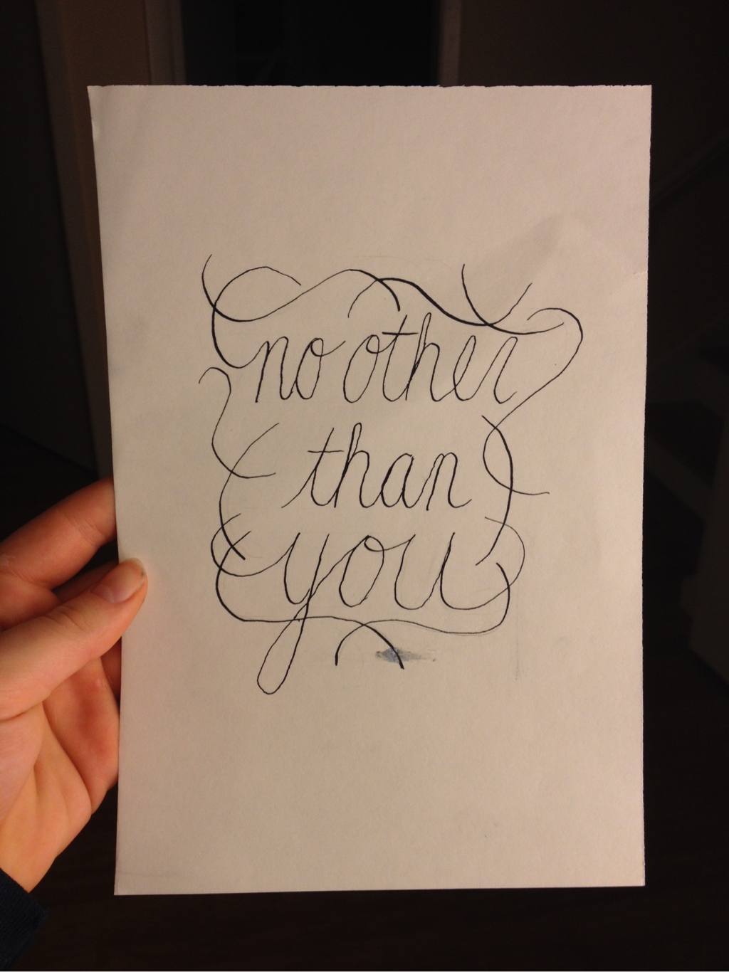 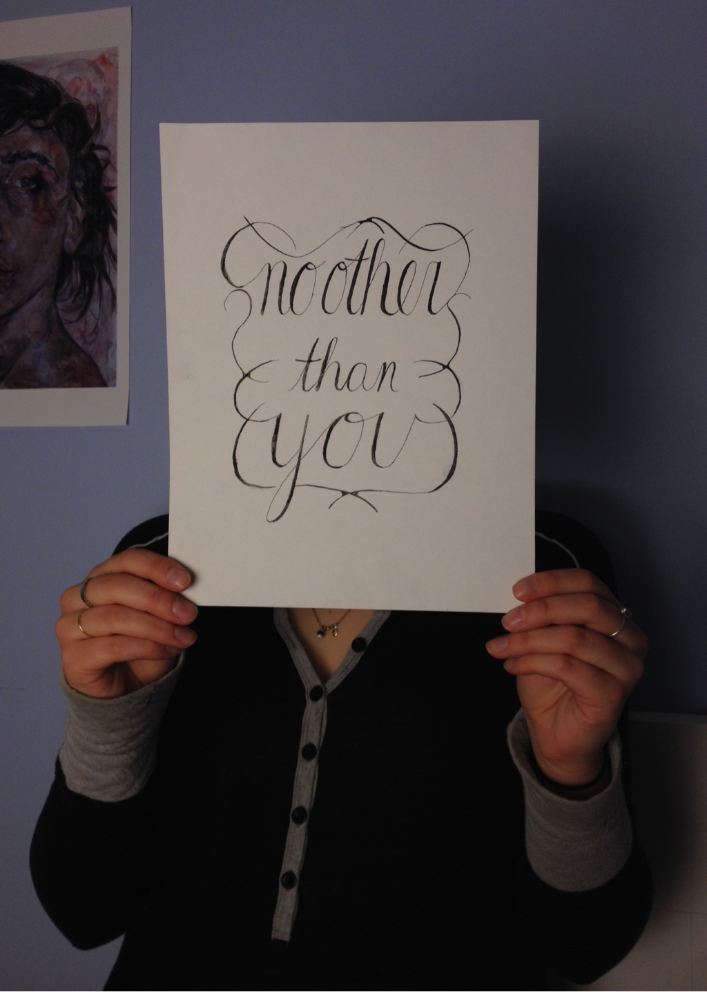
0 Comments
I started by choosing a light bulb to paint. I did many different colours because I wasn't sure if I needed many testers. In the end I chose purple because the black paint showed up better and the light colour went with the bright/light idea. The quote came along because I wanted to link the words with the object and include light or brightness somehow, also the light bulb is little and the quote is saying how your light isn't little or insignificant. 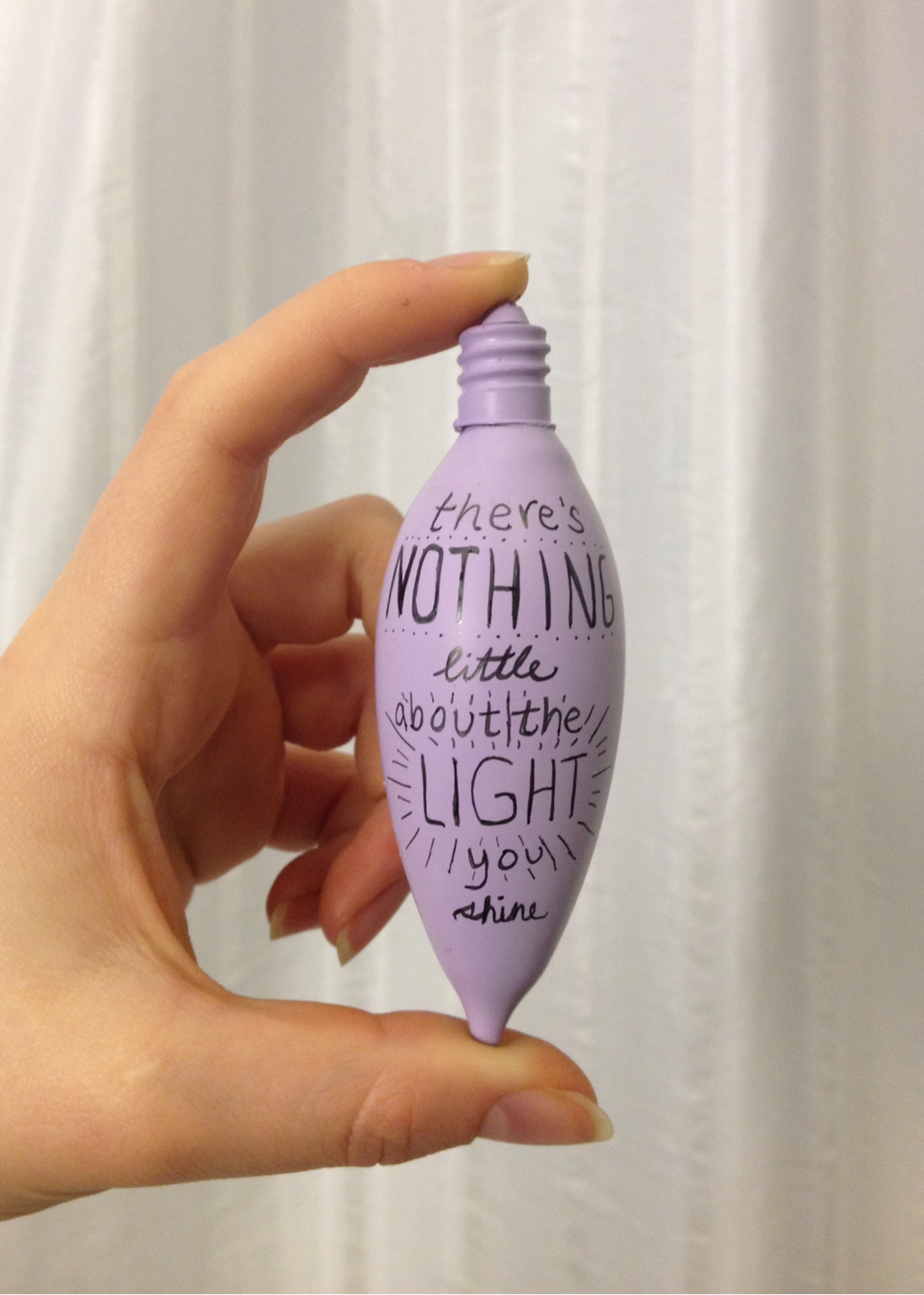 |
AuthorWrite something about yourself. No need to be fancy, just an overview. Archives
April 2016
Categories |
 RSS Feed
