|
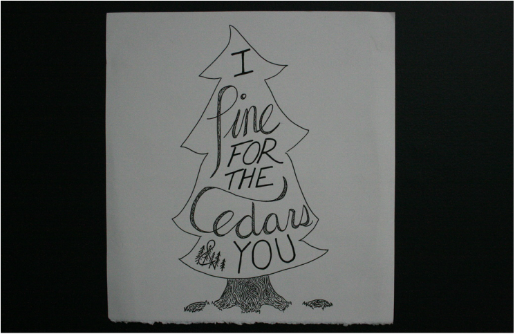
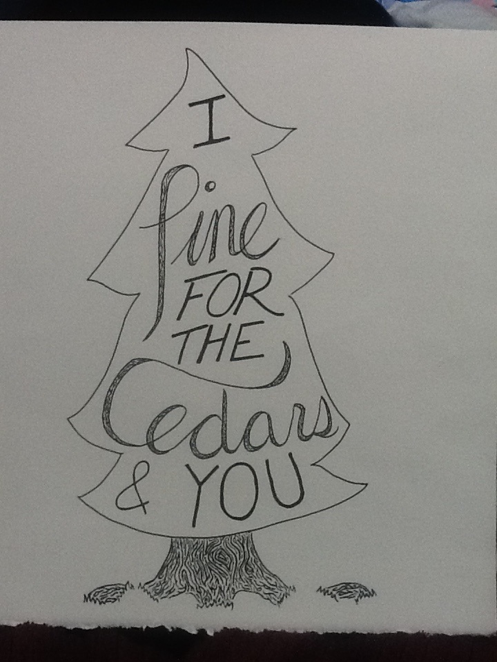
The quote "I pine for the cedars and you" is from a song by Dan Mangan. I chose it because I adore the song and, quite frankly, I love trees. In the beginning, I explored using cursive and capitol lettering, and many different ways to place the words together. I settled on the most clear and simple design so that it would not take away from the words themselves. Pencil crayon is my favourite medium and so I like to brainstorm using it. For my final copy, I switched over to plain black pen so that I could continue the minimal look I was going for. Originally, I had not planned to have the bark design in the cursive words, but I felt that it balanced the piece better. Overall, I am really pleased with the result and my favourite part is the bark detailing and the cursive lettering. 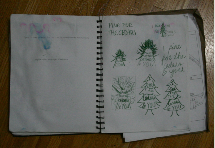 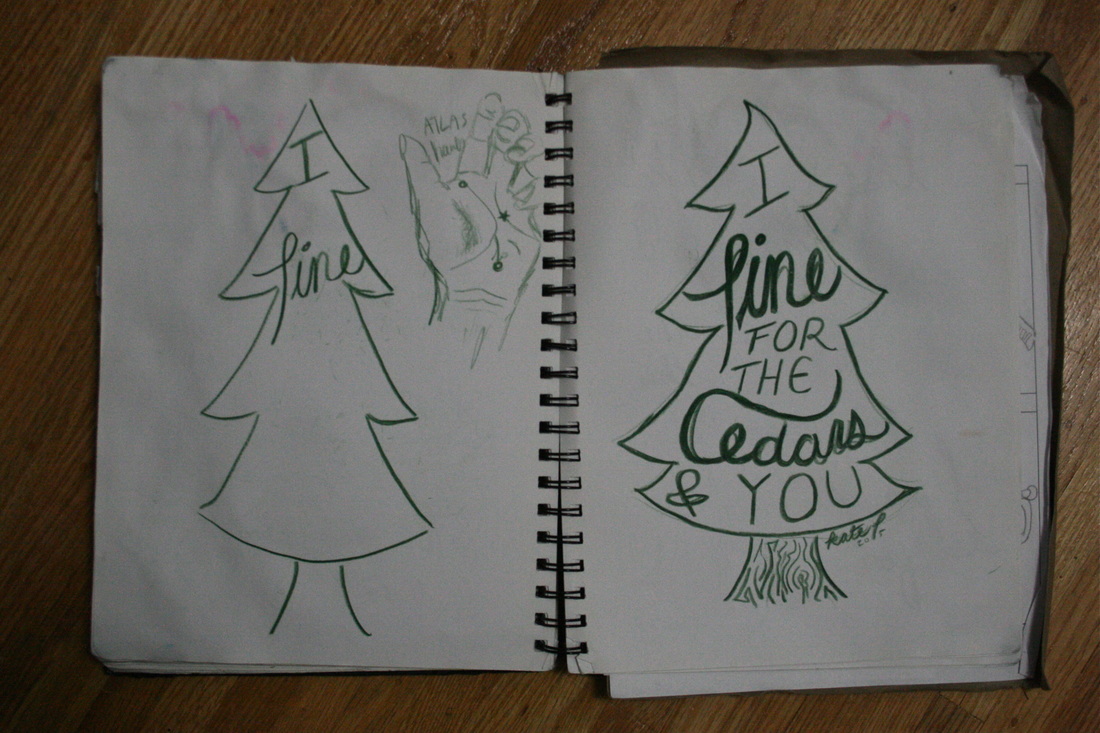
0 Comments
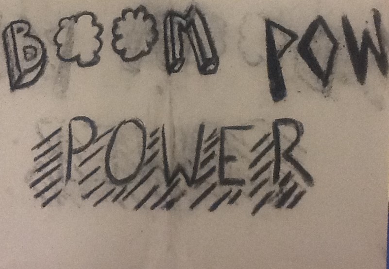
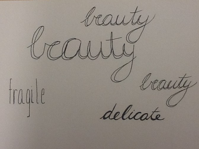
I really enjoyed doing this warm-up and I like how all my fonts turned out. I thought that each song allowed me to try to make many different styles of font; Intense capitol letters, simple lowercase and delicate cursive. My favourite creation is the word "POWER" because I like how I used the line to create a sense of motion. It makes the word come alive. My favourite media were the black pens and white paper. Overall I thought this activity was a great way to exercise my mind.
Sketching out ideas before fully committing is how I always go about creating art. I usually develop the idea in my brain and then go from there. This particular example of sketching ideas out is very neat and I stuck with the ideas originally formed in my head. Some other work I have done in the past has been all over the page and overlapping each other. For this assignment, I find creating fonts easier if I connect the word I am writing to the style of design. My best example of that is the water droplet design demonstrated by the word rain. Designing comes more naturally if I am able to make connections throughout. 
There were some ideas that came naturally and some that did not come as easily. As soon as I saw the pieces we had to work with, a creation for the letter 'o' came into my mind. It seemed simple, yet interesting to make the letter 'o' out of 'o's. An example of a challenge would be the letter 's', because we could not find symmetrical, curving pieces. Finally, when that masterpiece came together, it turned out to be my favourite. Looking at them now, I would have done a few differently to make them fit more into the group and be more harmonious , however I still think they turned out great.
|
AuthorWrite something about yourself. No need to be fancy, just an overview. Archives
April 2016
Categories |


 RSS Feed
