|
I am glad we got to play around with different styles of ampersands. I regularly use the typical style in my everyday writing (&) but I never explored deeper into it or the style that looks like an 'E'. I am really excited about my sea theme because I enjoy doing illustrative design and this way, I got to incorporate little drawings of my favourite sea creatures. I have been waiting for the opportunity to do something sea themed because I have grown up sailing the BC coast, so there lies a lot of memories in our waters for me. 
1 Comment
I loved working with the chalk. It forced me to not use what I usually, which is pen because it has a lot of control. I think I chose my colours wisely and I repeated them to make the piece look more together. I could have added something to fill the space in the 'M' of mind, instead of having it so empty. 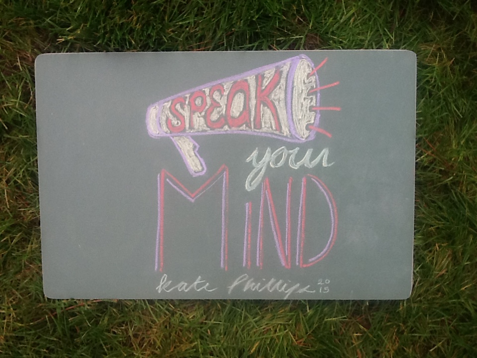 I picked this magazine cover because its really complex, but at the same time it feels simple. The pattern in the background is very busy but it does not overwhelm the rest of the photo. Also, the colours are neutral tones and it makes the piece look less busy and ties it together. I really like the photograph with drawing overtop, it adds another layer to it and gives it depth.  |
AuthorWrite something about yourself. No need to be fancy, just an overview. Archives
April 2016
Categories |

 RSS Feed
