|
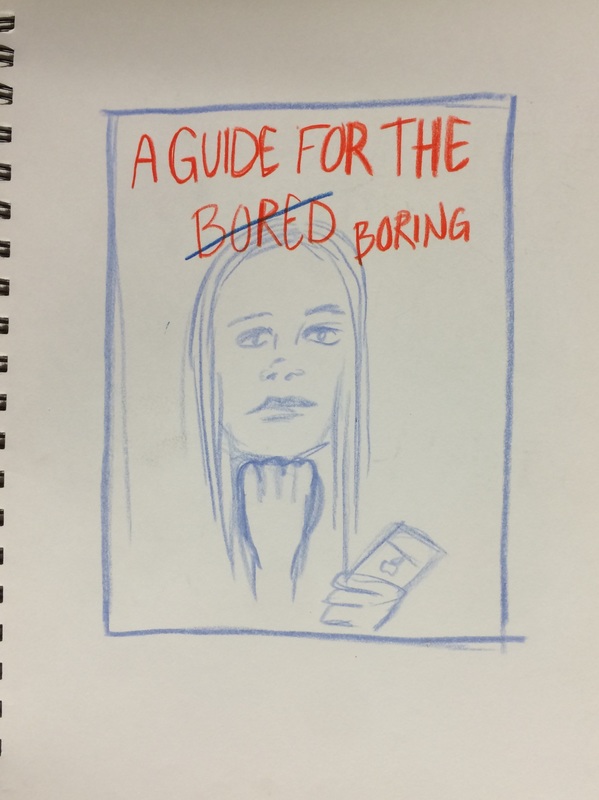
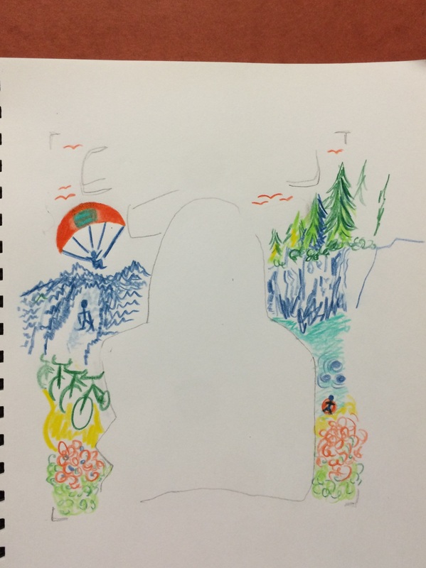
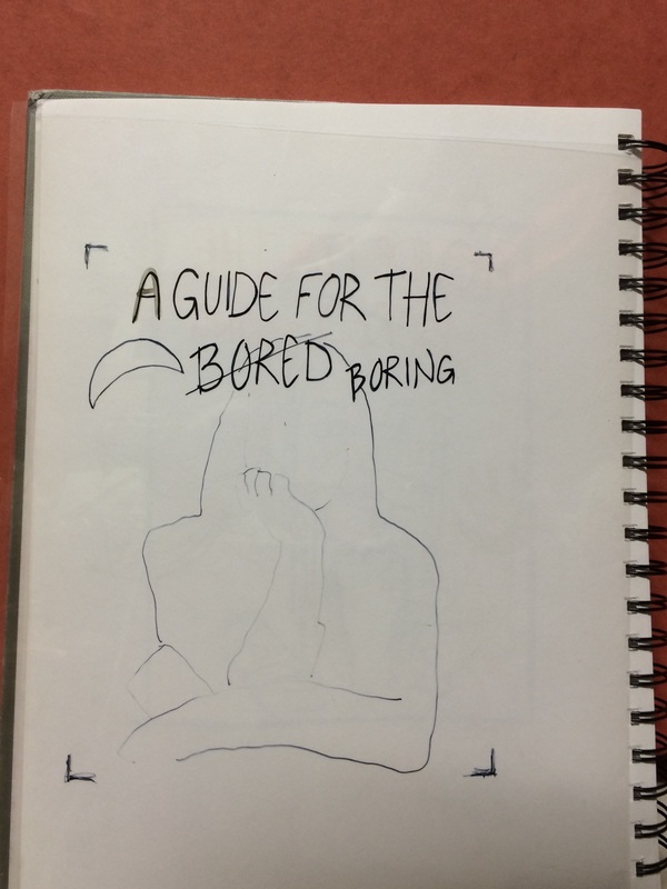
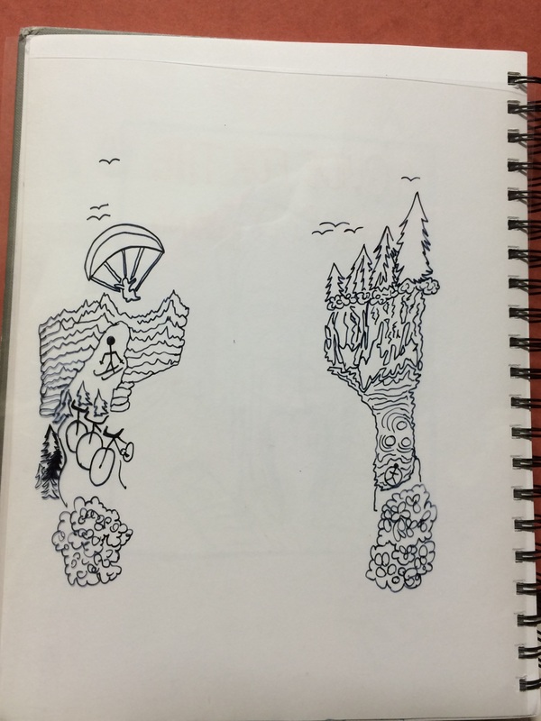
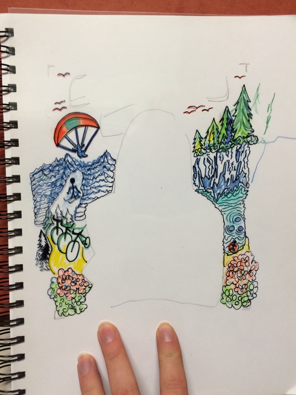
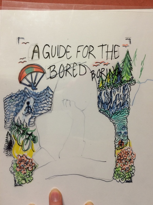
When we did magazine cover research I found myself most liking the photographs with illustrations over top. I plan on taking a photo and then illustrating over top as I think it adds some depth to it and makes it more interesting. I also took an interest in a hand lettered, upper case writing that is not perfect looking. I want to make my cover look like someone wrote it themselves (see the image below for my source of inspiration). My cover touches on the topic that some humans overuse technology and so we often overlook activities we could be doing instead, like being outside. I recognize that technology has allowed for more creativity and opportunity for some, and even allowed for us to appreciate outdoor activities even more, however this addresses useless internet surfing or extra time spent on devices for no reason. The magazine will be caleld "A Guide for the bored (scratched out and replaced with) boring" because as my grandfather used to say, those who are bored are boring. The risk I am going to take is by doing the hand lettering and also the illustrations over top, it could look unprofessional and unfinished, but I really want to explore that style anyways.
0 Comments
|
AuthorWrite something about yourself. No need to be fancy, just an overview. Archives
April 2016
Categories |


 RSS Feed
