|
Snapchat has a cool feature to it that allows for users to upload a 'geofilter' that anyone can use on their photos if one is in the according location. I designed one for Collingwood because I felt that in a newly established building with our community thriving, it was another step for bringing people together and representing Collingwood. Unfortunately, snapchat rejected it because it did not fit their criteria. I am unsure what exactly I did not do correctly for them but I plan on resubmitting in a short while. In terms of design, I really like what I did with it. Again, maybe I could have made both yellow words the same thickness of line but overall I like how it looks hand-drawn and not quite perfect like a computerized font does. I chose the words ''Home of the Cavs" because Katie Macrae suggested it to be short but impact. This felt fitting for that. I enjoyed the long process of planning, designing, drawing, and putting it into illustrator. 
0 Comments
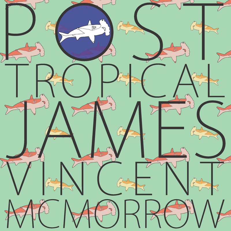
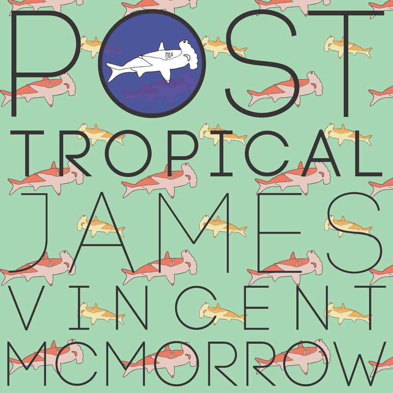
I really enjoyed this project, mostly because I got to be inspired by my favourite musician and also because I learned to appreciate album art, because it is so difficult to get an idea across that perfectly sums up a whole compilation of ideas and lyrics. I repeated the hammer head shark illustration in a pattern and in the 'o' of 'POST'. I love the tropical themed colours and how I used them in the sharks. I think that if I were to change something, I would have found a font that had 'o's that were perfect circles so that the blue shark circle 'o' is not the only perfect circle. Alterations I made: I took the advice of my classmates and I changed my lettering to make it more clear. People did not know how it was read and I bolded the Post Tropical part so its clear that the album is called Post Tropical and the artist is James Vincent McMorrow.
This project was fun for me because I liked how it was so open. We could take the theme of fall and do anything with it. I chose this quote because I swear I've said this myself before. I think most people will agree that October is one of the best months because it is full of colour and turns the world extra beautiful. Things I like about my piece: - I think I illustrated the wind and got the idea across very well. - The font of "glad, world, Octobers" is different and pretty consistent. Things to improve: - The background, being more creative with it. - Keeping the line thickness even and font size. 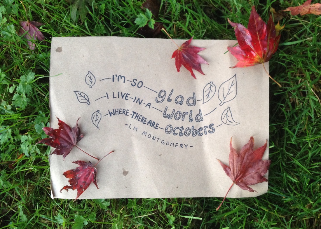 |
AuthorWrite something about yourself. No need to be fancy, just an overview. Archives
April 2016
Categories |
 RSS Feed
