|
I am glad we got to play around with different styles of ampersands. I regularly use the typical style in my everyday writing (&) but I never explored deeper into it or the style that looks like an 'E'. I am really excited about my sea theme because I enjoy doing illustrative design and this way, I got to incorporate little drawings of my favourite sea creatures. I have been waiting for the opportunity to do something sea themed because I have grown up sailing the BC coast, so there lies a lot of memories in our waters for me. 
1 Comment
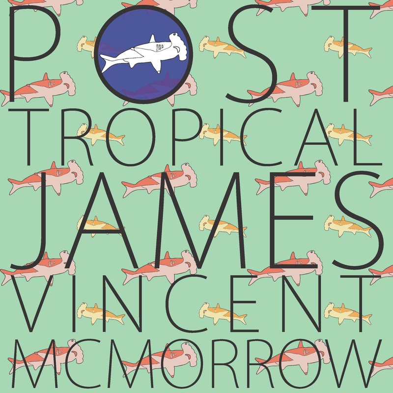
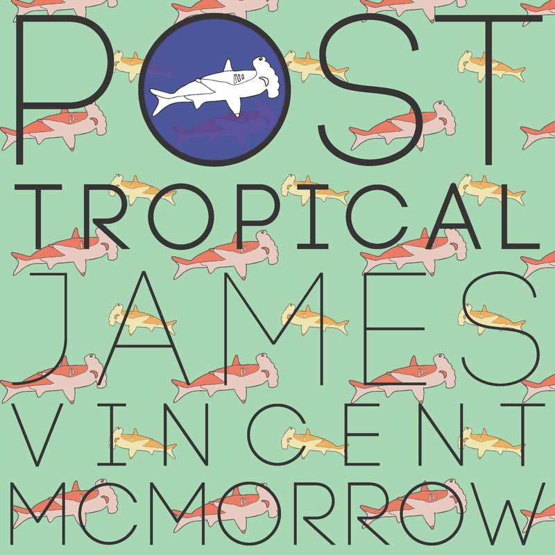
I loved working with the chalk. It forced me to not use what I usually, which is pen because it has a lot of control. I think I chose my colours wisely and I repeated them to make the piece look more together. I could have added something to fill the space in the 'M' of mind, instead of having it so empty. 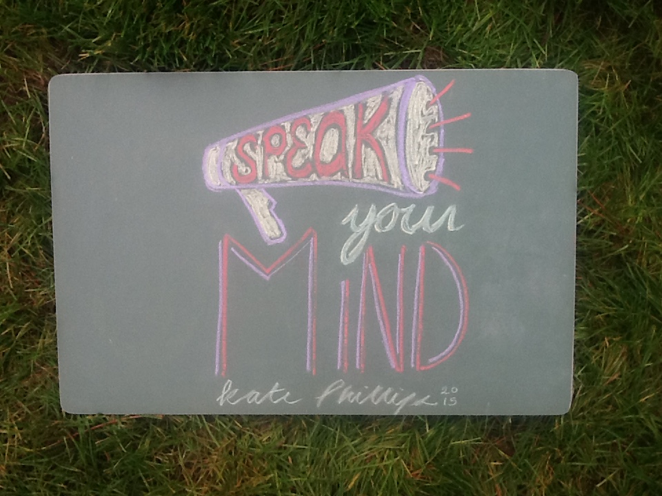 I picked this magazine cover because its really complex, but at the same time it feels simple. The pattern in the background is very busy but it does not overwhelm the rest of the photo. Also, the colours are neutral tones and it makes the piece look less busy and ties it together. I really like the photograph with drawing overtop, it adds another layer to it and gives it depth.  Snapchat has a cool feature to it that allows for users to upload a 'geofilter' that anyone can use on their photos if one is in the according location. I designed one for Collingwood because I felt that in a newly established building with our community thriving, it was another step for bringing people together and representing Collingwood. Unfortunately, snapchat rejected it because it did not fit their criteria. I am unsure what exactly I did not do correctly for them but I plan on resubmitting in a short while. In terms of design, I really like what I did with it. Again, maybe I could have made both yellow words the same thickness of line but overall I like how it looks hand-drawn and not quite perfect like a computerized font does. I chose the words ''Home of the Cavs" because Katie Macrae suggested it to be short but impact. This felt fitting for that. I enjoyed the long process of planning, designing, drawing, and putting it into illustrator.  I really enjoyed this project, mostly because I got to be inspired by my favourite musician and also because I learned to appreciate album art, because it is so difficult to get an idea across that perfectly sums up a whole compilation of ideas and lyrics. I repeated the hammer head shark illustration in a pattern and in the 'o' of 'POST'. I love the tropical themed colours and how I used them in the sharks. I think that if I were to change something, I would have found a font that had 'o's that were perfect circles so that the blue shark circle 'o' is not the only perfect circle. Alterations I made: I took the advice of my classmates and I changed my lettering to make it more clear. People did not know how it was read and I bolded the Post Tropical part so its clear that the album is called Post Tropical and the artist is James Vincent McMorrow.
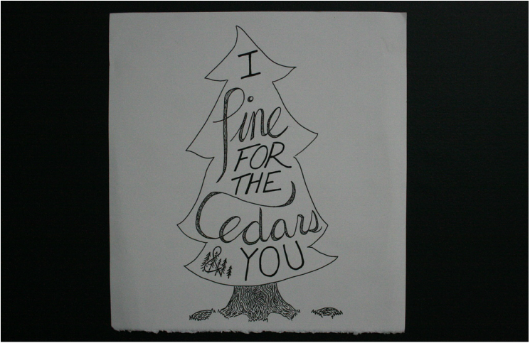
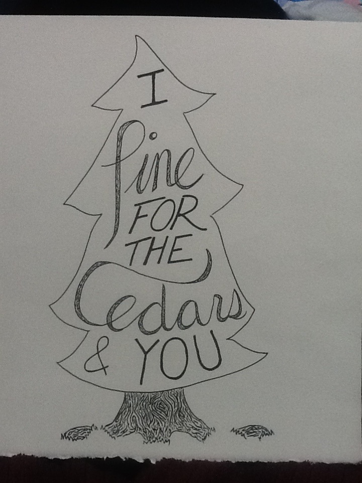
This project was fun for me because I liked how it was so open. We could take the theme of fall and do anything with it. I chose this quote because I swear I've said this myself before. I think most people will agree that October is one of the best months because it is full of colour and turns the world extra beautiful. Things I like about my piece: - I think I illustrated the wind and got the idea across very well. - The font of "glad, world, Octobers" is different and pretty consistent. Things to improve: - The background, being more creative with it. - Keeping the line thickness even and font size. 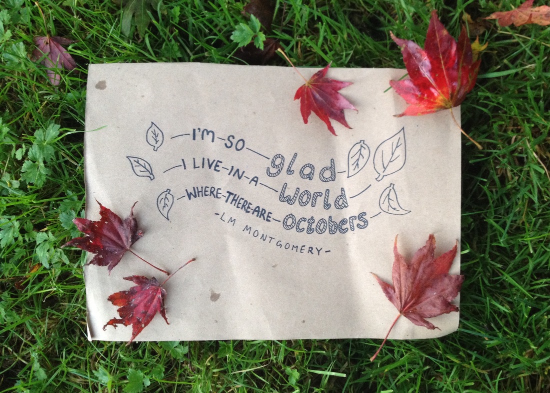 The quote "I pine for the cedars and you" is from a song by Dan Mangan. I chose it because I adore the song and, quite frankly, I love trees. In the beginning, I explored using cursive and capitol lettering, and many different ways to place the words together. I settled on the most clear and simple design so that it would not take away from the words themselves. Pencil crayon is my favourite medium and so I like to brainstorm using it. For my final copy, I switched over to plain black pen so that I could continue the minimal look I was going for. Originally, I had not planned to have the bark design in the cursive words, but I felt that it balanced the piece better. Overall, I am really pleased with the result and my favourite part is the bark detailing and the cursive lettering. 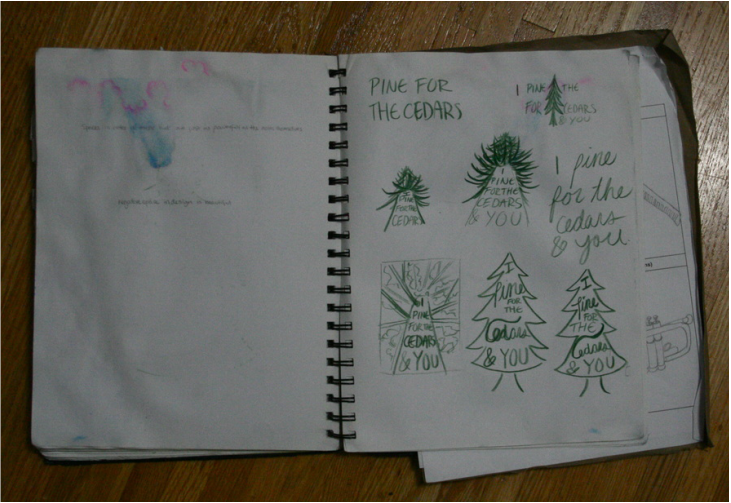 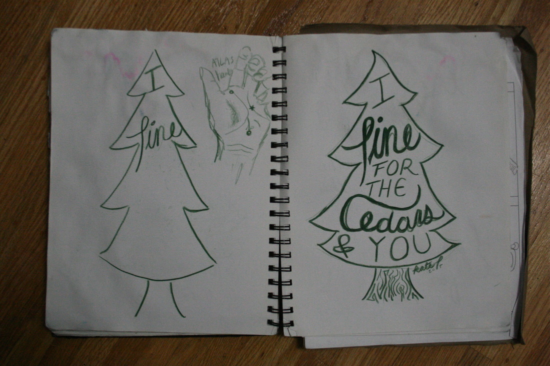
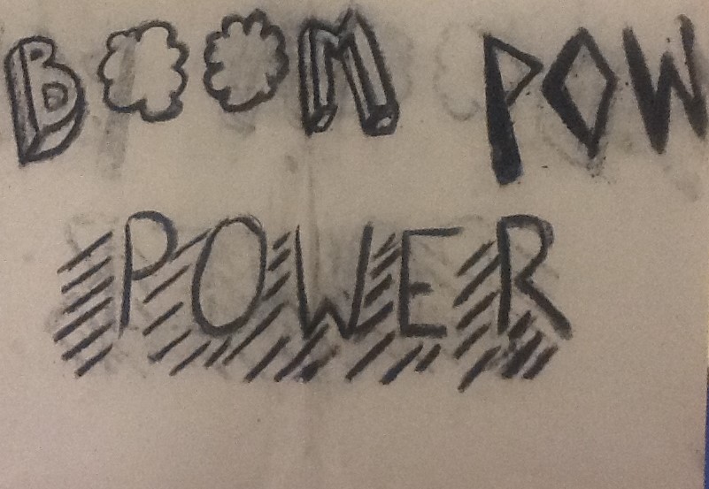
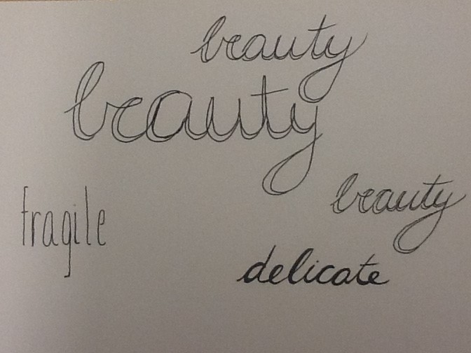
 I really enjoyed doing this warm-up and I like how all my fonts turned out. I thought that each song allowed me to try to make many different styles of font; Intense capitol letters, simple lowercase and delicate cursive. My favourite creation is the word "POWER" because I like how I used the line to create a sense of motion. It makes the word come alive. My favourite media were the black pens and white paper. Overall I thought this activity was a great way to exercise my mind.
Sketching out ideas before fully committing is how I always go about creating art. I usually develop the idea in my brain and then go from there. This particular example of sketching ideas out is very neat and I stuck with the ideas originally formed in my head. Some other work I have done in the past has been all over the page and overlapping each other. For this assignment, I find creating fonts easier if I connect the word I am writing to the style of design. My best example of that is the water droplet design demonstrated by the word rain. Designing comes more naturally if I am able to make connections throughout.  |
AuthorWrite something about yourself. No need to be fancy, just an overview. Archives
April 2016
Categories |


 RSS Feed
